

From AI Concept to Production Identity: When AI Should Write SVG
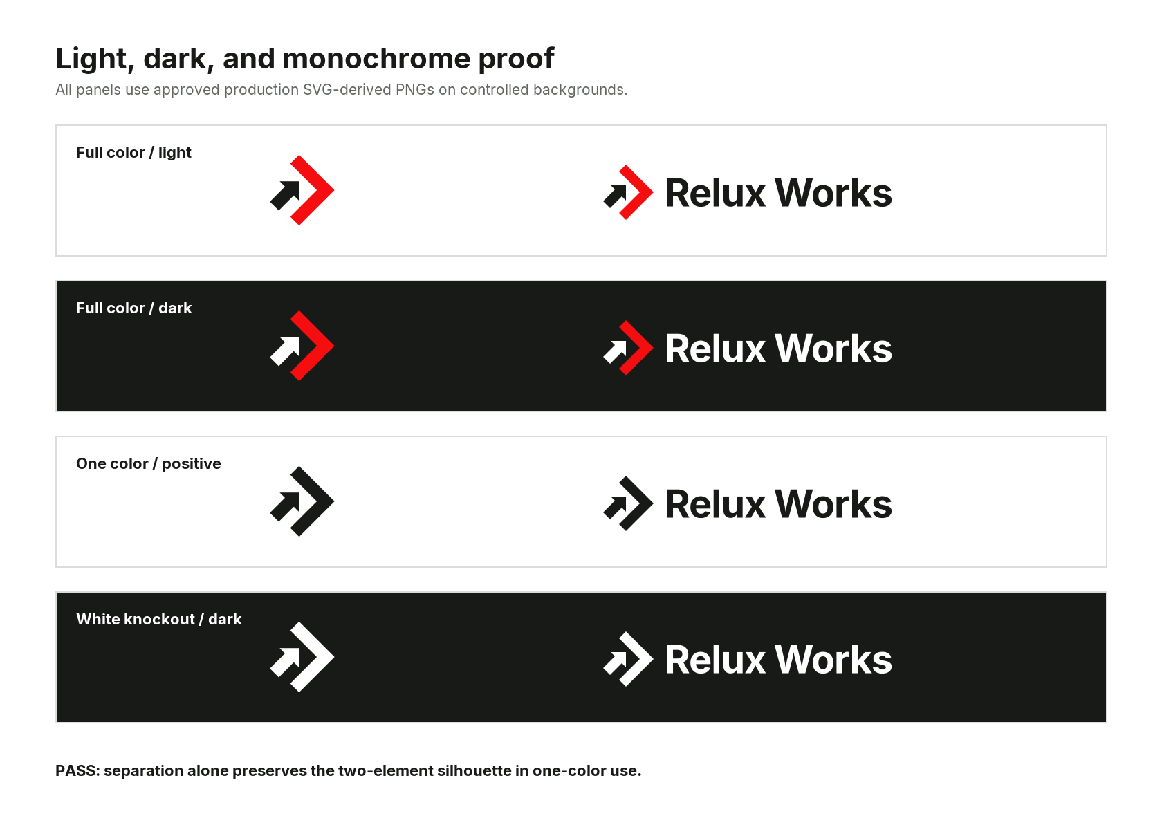
The finished identity family across full color, dark background, one-color, and knockout use.
Generated pixels can set a direction; carrying that direction into production takes explicit geometry, controlled decisions, and independent proof.
Four lessons carried the project:
- Choose the representation according to what remains uncertain.
- Reconstruct intended relationships when raster artifacts would mislead a tracer.
- Turn visual critique into constraints, comparisons, authority limits, and evidence.
- Test optical decisions at native delivery sizes and validate outputs independently.
Relux Works delivered editable and outlined lockups; full-color, one-color, knockout, and dark-background variants; favicons, avatars, screen exports, print files, and usage guidance. The symbol stays clear at 16 pixels and in a 10 mm print proof. One command rebuilds the package from source.
Choose the representation before the model
Early in the project, metaphor, composition, and silhouette were still open questions, while the production requirements had already hardened: two elements, sharp corners, an open gap, flat color, one-color recognition, and a mark that stayed clear at small sizes. That split kept exploration free while giving every output a rejection test.
There is no universally best AI workflow for logo design. The useful choice depends on what is still unknown.
- Use an image model while exploring metaphor, gesture, composition, and broad silhouette. It can move quickly through visual territory that would be tedious to describe as coordinates.
- Ask a language model to write SVG when the mark is flat, geometric, and honestly expressible through axes, ratios, primitives, and a small palette.
- Use automatic tracing when the source is already clean, hard-edged, high contrast, and close to production artwork. Treat the trace as a scaffold when the geometry has meaningful constraints.
- Use a vector editor for organic curves, expressive lettering, Boolean construction, and optical adjustments that are easier to see than to specify numerically.
The first Relux concept did useful diagnostic work. A language model produced real SVG and encoded our four-step agent loop with literal accuracy. At logo scale, the result behaved like process machinery and read as sync or recycling iconography long before it read as a company mark.
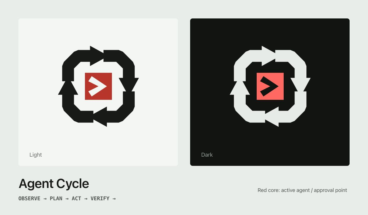
Direct SVG generation captured the system faithfully enough to reveal that the system itself was too much information for one mark.
That diagnosis changed the remaining question from construction to visual reduction. How much could disappear while preserving motion and intervention? GPT Image produced a large right-facing red chevron and a smaller northeast arrow. We approved the silhouette as a direction and kept the generated pixels as a reference.
For this kind of exploration, a short acceptance contract is more useful than a long stylistic prompt:
Subject:
  one large right-facing chevron
  one small northeast arrow
Keep:
  sharp corners, open gap, clear hierarchy
Avoid:
  loops, boxes, extra arrows, effects
Discard:
  all generated lettering
Approve:
  silhouette and direction only
Replace generated type, and keep the raster as a reference even after approving the visual direction.
Compile critique into a decision protocol
A separate gpt-5.6-sol conversation assessed the generated PNG before Codex began
production work. It translated design criticism into an execution brief, organizing
geometry, weight, placement, color, and lockup questions into narrow, reviewable
passes.
Its value lay in separating fixed intent from testable hypotheses. Two shapes, their
directions, sharp corners, flat colors, and the open gap stood as invariants. The 0.4T
clearance, where T meant the perpendicular thickness of one red arm, the
100-versus-95-percent arrow-weight comparison, and the initial lockup ratios entered
the brief as hypotheses, each of which still had to survive native-size rendering.
It also translated the remaining uncertainty into conditions. The brief authorized a micro version only if the master failed between 16 and 24 pixels and required Codex to inspect the repository before choosing a font or color. It set a clear escalation boundary for typography: complete the symbol, but do not call the lockup final until the licensed font is identified. Preliminary similarity research was permitted, while formal trademark clearance remained outside the agent’s authority.
Codex received a decision protocol: construct the assets, render controlled candidates, inspect the evidence, revise visible failures, then deliver sources, exports, proofs, and a QA record. Humans retain responsibility for intent, consequential approvals, licensing, and legal clearance.
Direct SVG generation asks for construction
Where image generation trades in appearance, direct SVG generation commits to construction.
That distinction matters because the .svg suffix does not certify production
quality: the SVG specification allows an
.svg file to carry an embedded bitmap, so a production review should inspect the
elements inside it.
For restrained geometric artwork, the source can be much simpler than the preview. Our
final symbol uses a normalized 100 × 100 viewBox and two filled paths. The red
chevron has six anchors. The northeast arrow has seven.
Red:
M48 10 L88 50 L48 90
L38 80 L68 50 L38 20 Z

Ink:
M15 63 L32 46 L26 40 L48 40
L48 62 L42 56 L25 73 Z
Those coordinates expose the construction for review. We can verify the tip at (88, 50), reflect the red arms across the centerline, check the arrow’s symmetry about its
45-degree axis, and calculate the minimum gap. The resulting
production SVG
is small enough to understand without an editor.

A useful direct-SVG prompt behaves like a production contract:
Canvas: viewBox="0 0 100 100"
Geometry:
  45-degree and 90-degree edges
Invariants:
  mirrored arms, centered tip, open gap
Artwork:
  filled paths only, minimal anchors
Exclude:
  image, text, stroke, gradient,
  filter, mask
Output:
  SVG plus measured bounds and clearances
Proof: render at 16, 24, 32, and 64 pixels
The constraints should describe the intended construction. A request for visual similarity alone leaves the relationships ambiguous. Coordinate correctness still needs visual judgment: valid XML and exact symmetry can add up to a perfectly lifeless mark.
From traced evidence to reconstructed intent
Once an image model has produced a convincing direction, there are two common routes back to vector artwork: tracing, which finds contours in the raster and turns them into paths, and reconstruction, which asks what geometric decisions could have produced the image and then draws those decisions directly.
The difference is easy to miss at first. Antialiasing, compression, gradients, and slight misalignment are all visible evidence, so a tracer has to respond to them. The official Inkscape guide for Trace Bitmap warns against expecting perfect fidelity. More fidelity would not have helped us anyway, because several visible details were defects.
Using the same definition of T, the upper and lower red arms in the GPT Image
reference measured roughly 141 and 139 pixels. The red tip landed slightly below its
best centerline. The black stem was about 0.79T, while its nearest clearance changed
from approximately 0.22T above to 0.36T below. The raster also contained gradients
and color variation that did not belong to the identity.
Thresholding and smoothing may discard or alter some defects, but a trace cannot infer which relationships were intended. However carefully we tuned it, it would have either carried those differences forward or distorted them further, without ever knowing which ones deserved correction.
Reconstruction was the decisive production step. We preserved the recognizable
direction and replaced incidental pixels with explicit relationships: two elements,
two directions, square cuts, mirrored red arms, one flat red, one ink value, and an
open internal gap. The final clearance is exactly 0.4T. At that point, an approved
picture became an identity system.
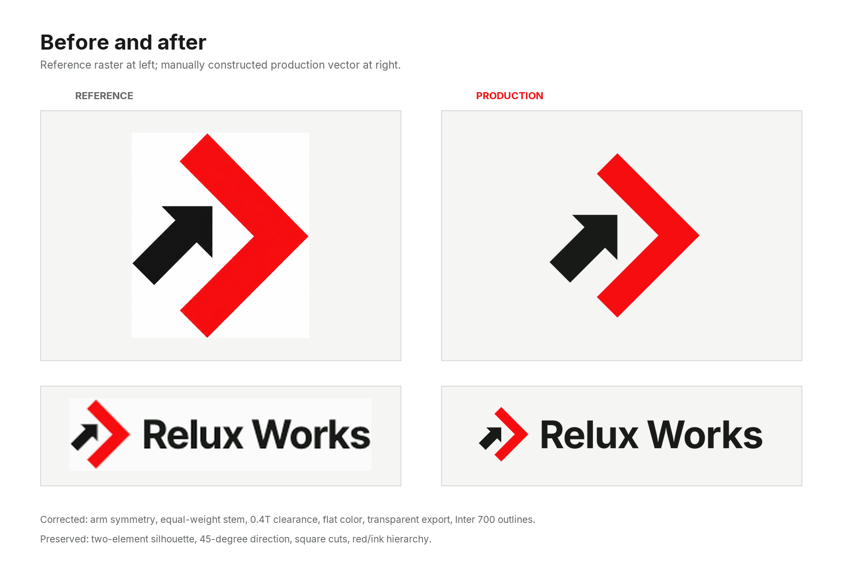
Reconstruction took the gestalt of the generated image and gave it the discipline of a system.
Tracing keeps its place for flat source artwork whose contours are already the design, and for organic marks where a traced path can start a manual cleanup. Circles, shared radii, mirror axes, equal bar weights, and intentional negative space sit beyond its reach, because pixels simply do not carry those relationships.
We used Inkscape as a compiler
We assigned Inkscape the part of the pipeline it could make deterministic: converting pinned live type into portable production outlines. The symbol never entered that stage; its paths stayed governed by the coordinate source.
The wordmark called for its own treatment. We wanted an editable live-type master in Inter Bold 700 and portable production lockups with outlined letters. The build bundled the official Inter 4.1 font files and pointed Fontconfig at that private font directory. Inkscape 1.4.2 then ran headlessly:
SRC=relux-lockup-horizontal-live-type.svg
TARGET=horizontal-outlined-test.svg
OUT=tests/renders
CACHE=/tmp/relux-works-font-cache

export FONTCONFIG_FILE=tools/fonts.conf
export XDG_CACHE_HOME="$CACHE"

inkscape "source/$SRC" \
  --export-text-to-path \
  --export-plain-svg \
  --export-filename="$OUT/$TARGET"
The relevant Inkscape command-line options turn the live text into paths and request a portable Plain SVG. We still did not ship that raw file; a cleanup script extracted the wordmark path and rebuilt a minimal SVG around it.
We retained both sources:
- the live-type SVG for editing, with the font family, weight, spacing, and exact text;
- the outlined SVG for production, with no font dependency at delivery time.
Inkscape also rendered the live and outlined horizontal lockups at the same width.
Pillow’s ImageChops
compared the two renders, and difference(...).getbbox() had to return None: zero
differing pixels. This caught changes introduced during outlining, spacing, or cleanup.
General screen exports went through
rsvg-convert;
Inkscape stayed responsible for typography alone.
The complete package rebuilt through one command:
python3 tools/build_all.pyIt regenerated vector sources, outlined type, screen exports, proof sheets, and print files before running the checks.
Native-size rendering is part of drawing
Optical balance still needs judgment. We made that judgment reviewable by converting one concern, the black arrow’s apparent weight, into a controlled experiment.
We built two arrow candidates. One gave the black stem the same thickness as a red arm. The other reduced it to 95 percent. Every unrelated variable stayed fixed. Both looked plausible when enlarged.
At 24 pixels, the thinner arrow lost presence without making the gap feel any more open. The equal-weight version won; the arrow’s smaller footprint already provided the hierarchy.
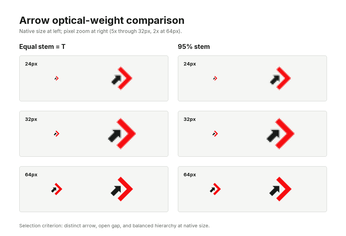
The useful answer appeared at its smallest intended size.
This is a repeatable way to resolve optical questions:
- Express one question as two controlled candidates.
- Keep every unrelated variable fixed.
- Render both at actual delivery sizes.
- Decide from the smallest meaningful view.
- Adjust placement and negative space before deforming the shapes.
We then rendered the selected master at 16, 24, 32, 48, 64, and 128 pixels, plus a 10 mm print proof. The master passed at 16 pixels, so the conditional micro branch was not triggered.
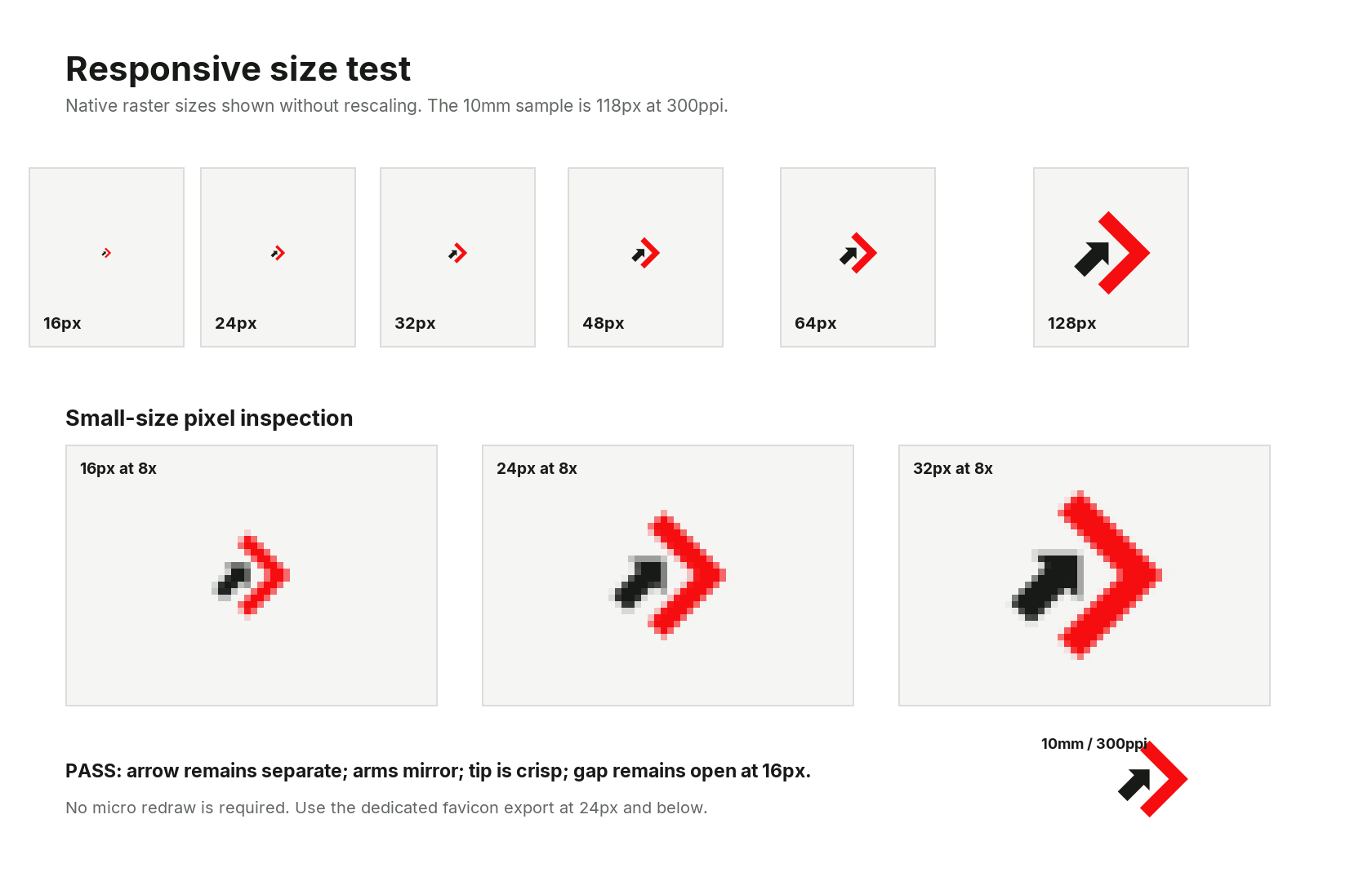
Node placement dominates the conversation at 400 percent zoom, and almost none of that survives the trip down to 24 pixels, where the mark lives on silhouette, spacing, and color separation alone.
Validate what the file does
A file can parse successfully and still fail its only job.
Our checks were organized in layers:
- Structure: production SVGs contain paths and approved fills, with no embedded images, live strokes, gradients, filters, masks, clipping debris, or live text.
- Geometry: actual parsed paths satisfy the axes, reflections, thickness, tip, clearance, bounds, and anchor limits.
- Raster output: dimensions, transparency, outer corners, and every native favicon frame are inspected.
- Visual behavior: the mark is rendered at native sizes, on light and dark backgrounds, and in positive and knockout one-color treatments.
- Print output: PDF files contain DeviceCMYK fills; EPS files contain CMYK
setcmykcolorcommands and a valid paint operator. Neither format contains fonts or images, and both render visibly in an independent reader.
The print layer earned its place the hard way. One early CMYK build passed values on
the wrong numeric scale. Another EPS contained all the correct coordinates and no
painting operator, so it opened as a perfectly blank file. We fixed the exporter to
emit eofill, then used
Ghostscript to render every EPS
and confirm that visible pixels actually existed.
Both faults were caught inside the build, before anything could be approved or shipped.
The result shipped as an identity system
The website now uses the approved artwork in its header, footer, favicon bundle, social metadata, and localized pages. The mark remains left-to-right inside RTL layouts and switches to approved one-color artwork in forced-colors mode. The public brand reference keeps those rules inspectable for product teams and future agents.
A reusable AI-assisted logo pipeline
The process now fits into eight steps that travel well beyond this mark.
- Use the right search space. Explore appearance with an image model, and generate SVG directly when the unknowns can be stated as geometry.
- Freeze the intent. Write down the elements, directions, hierarchy, axes, palette, forbidden motifs, and minimum-size target before refining pixels.
- Compile the handoff. Turn critique into invariants, controlled comparisons, deliverables, checks, and clear escalation boundaries before execution begins.
- Choose tracing carefully. Trace clean contours when contours are enough, and reconstruct primitives and relationships when the design depends on them.
- Keep editable and production type. Preserve a live-type source, outline a pinned font in a controlled environment, and compare both renders.
- Render the decision. Build controlled candidates and inspect them at real sizes.
- Use independent readers. A second renderer can expose unsupported features, missing paint operations, font substitution, and transparency mistakes.
- Ship the method with the files. Include source geometry, generation scripts, proofs, color and spacing rules, and one validation command.
That operating model underpins our AI MVP development, vibe-code rescue, and agentic enablement. Engineers define the constraints and verification boundaries, agents move quickly inside them, and Relux Works remains accountable for what ships and how it is handed over.
If you have a promising AI-generated direction that needs production discipline, tell us what you are building.